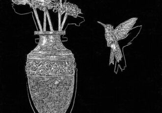
Artist Carmen Verdi presents a collection of portraiture and landscape drawings created with incredible complexity.
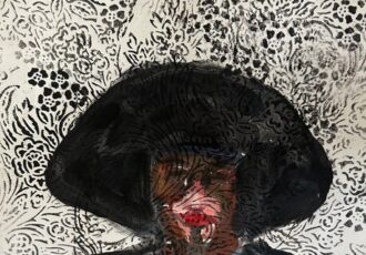
Featured Artist Frantisek Strouhal
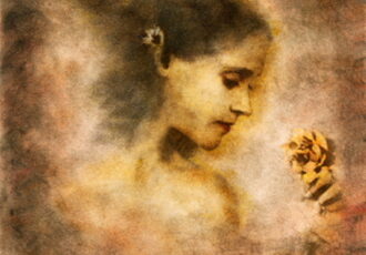
Artist Frantisek Strouhal presents an ethereal collection of figurative and still life images, each infused with a touch of mystery.
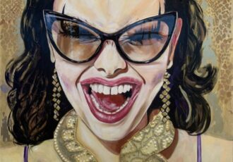
Featured Artist Anna Kaszupski
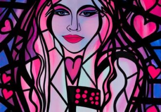
Featured artist Anna Kaszupski shares a charming collection of whimsical paintings that celebrate women.
Featured Artist Qingzhu Lin
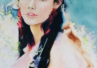
Painter Qingzhu Lin, on an artistic journey to find and express beauty, presents a striking portfolio of watercolor portraits.
Featured Artist Patrice Sullivan
Artist Patrice Sullivan shares a collection of paintings that resurrect family history and childhood memories.
Featured Artist Sylvia Cohen
Discover a captivating collection of expressive portraits depicting strong and beautiful women by contemporary painter Sylvia Cohen. Find more of her portfolio by visiting her website. As a contemporary portrait artist based in Montreal, Canada, my mission is to push the boundaries of realism and expressiveness. I often explore the intersection of realistic […]
Featured Artist Oscar Esteban Martinez
Artist Oscar Esteban Martinez presents a selection of portraits intended to show the diverse nature of humanity.
Featured Artist Ramon Aristizabal
Colombian artist Ramon Aristizabal shares a collection of vibrantly colorful works in his distinct painterly style.
Featured Artist Cindy Berceli
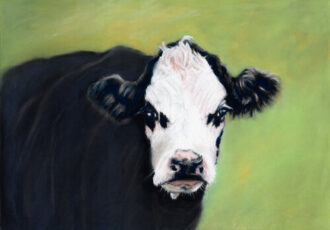
Artist Cindy Berceli shares a collection of captivating pastel paintings that reflect her bond with the animal world.
Featured Artist Alice Bailey
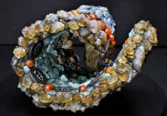
Artist Alice Bailey shares a selection of her highly detailed, one-of-a-kind mosaic sculpture.
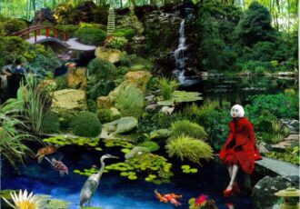
Featured Artist Jenny Pivor
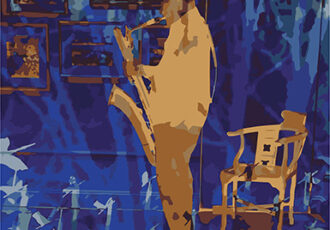
Artist Jenny Pivor shares a selection from her Jazzed series, using colorful photographic composites of musicians transposed with nature images.
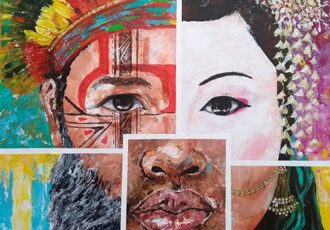
Featured Artist Siona Benjamin
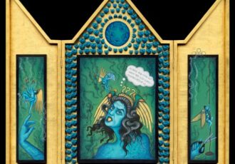
Artist Siona Benjamin presents a collection of figurative works based on her fascinating transcultural background.
Featured Artist Ann Schwartz
Artist Ann Schwartz creates delightful mixed media collages, each a tiny complex world of its own.
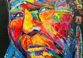
Featured Artist Nivia Bejerano
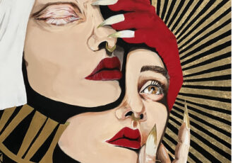
Artist Nivia Bejerano draws from traumatic childhood experiences to imbue her portraits of women with pain and power.