Painter Jonathan Ralston’s stunning portfolio reflects his study of architecture and light. Visit his website for more from this talented artist.
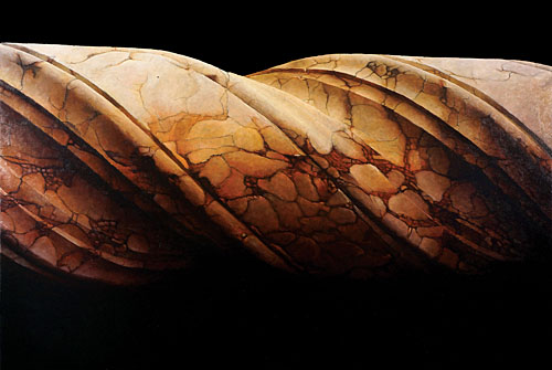
“Barley Twist Column” oil, 40″ x 60″
Why do I paint architecture? The subject matter chose me.
“Fontenay Abbey II” oil, 36″ x 24″
I gravitated to painting architecture in college although I didn’t know it at the time. My senior project was based on a mix of color theory and abstracted architecture. I broke the picture plan down into geometric patterns of flat color.
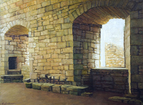
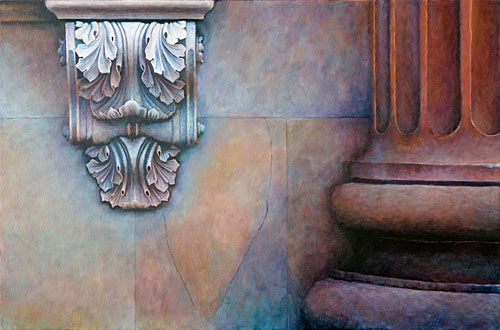
“Craignethan Castle II” oil, 18″ x 24″
At the time, the architecture I chose to paint was very different, much more modern and open. It was about slicing up the scene into small sections that could be represented by a single color, and architecture with its repeating patterns was a natural choice.
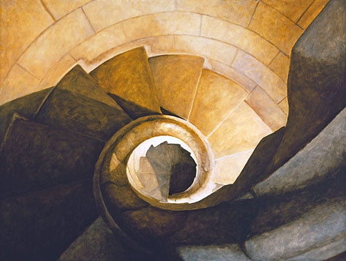
“Gaudi Cathedral” oil, 35″ x 46″
This evolved early on into the paintings I do now. There is still a strong sense of composition and color, but it has become more nuanced over the years. The architectural influence has remained constant.
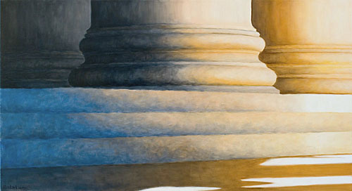
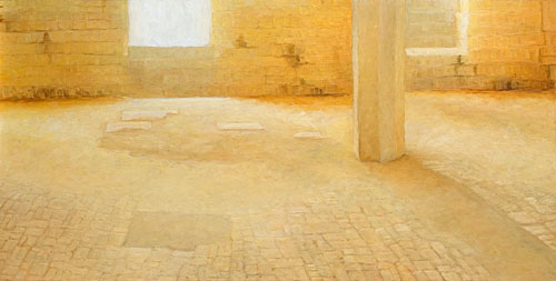
“DC Series IV” oil, 22″ x 40″
I find endless fascination with the intersection of light, geometry and material (usually stone) that make up my subject matter. The strong sense of pattern has also remained constant. The way a series of columns, stairs, or arches will repeat across the canvas, all the while changing in scale and color captivates me.
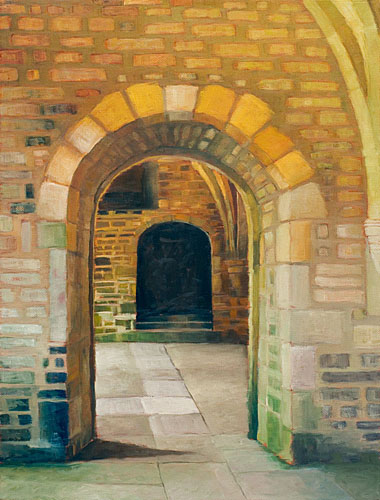
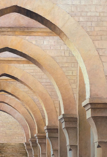
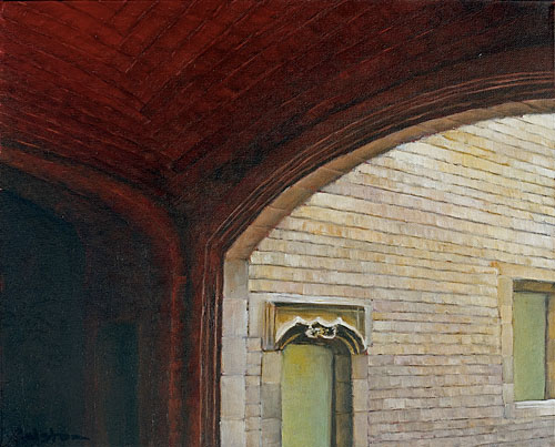
“Archway III” oil, 16″ x 12″
Working from the photos, I crop the composition down to what I feel are its key elements; the part that define the whole and has the most interest. This can take days to resolve, because I am also evaluating the color and light in the composition simultaneously.
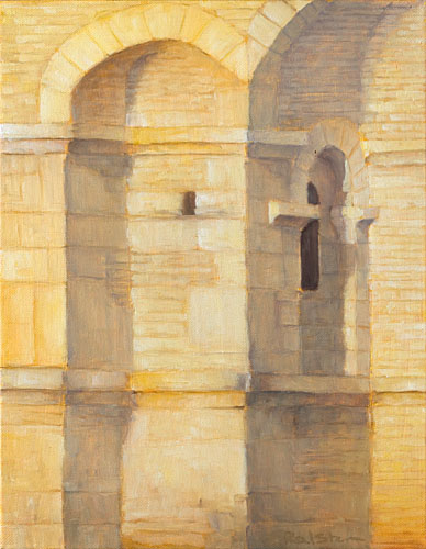
“Saint Juste de Valcabrère” oil, 14″ x 11″
The light values and colors can often help me arrive at the final edited version. This part of the process is a huge thrill. Seeing the composition evolve on the computer and in my head is the backbone of whole painting and usually determines the painting’s success. A strong start here inspires me through to the final brushstroke.
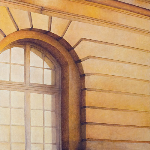
“Versailles VI” oil, 36″ x 36″
I build up the surface with multiple layers of thin paint. I like the visual effects I get when you can see colors stacked on top of each other. Yellow and blue does not always equal green. Layering the paint this way allows me to build up the richness of the surface by alternating degrees of lighter and darker paint as well as varying color.
“Charleston” oil, 24″ x 36″
For many years I’ve looked to Rembrandt as a source of guidance. The way he uses light and color are breathtaking.
“Barcelona” oil, 16″ x 20″
Every oil painting that I create depicts a real place, most of which I have personally visited. I prefer to stand in the environment myself. It gives me the mood of a space, which I can then capture in my paintings. I have visited and painted many places over and over again. When the light changes, the mood and energy also change.
“Clairvaux” oil, 20″ x 40″
Lately I have been gravitating towards more and more extreme contrasts in light and dark. I’m enjoying the enhanced drama and the increasingly saturated colors.
Jonathan Ralston invites you to follow him on Facebook, LinkedIn and Houzz.


Gorgeous colors. I have visited Versailles and DC.
You are just incredible, my Friend!!