by Carolyn Edlund
A conversation with artist and color consultant Barbara Jacobs reveals what artists need to know about interior color choices and design.
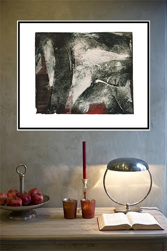
“Into the Wind” Monotype, Wanderers Series by Barbara Jacobs
AS: What does a color consultant do, and why do clients need their help?
BJ: It starts with a typical client concern, like “There are just too many colors to choose from!” or “Even though I know what I like, I’m overwhelmed trying to decide what to do.”
Whether for exterior or interior color selections, a consultant can be there to help. Their expertise is not limited to paint colors but covers any materials used in building and design. This includes roofing, stone, tiles, countertops, new windows in factory colors, and more. Other topics might come up. My personal experience in designing rugs and textiles, for example, often leads into those areas as well, and clients even ask my opinion about artwork selections.
Among the services a color consultant provides are selecting and specifying products, color, and finishes. In this process, the consultant has a variety of “deliverables” they can offer. Among them are preparing a detailed paint (or other product) plan, assembling mockups with paint sheets and other samples, and using digital image visualization processes. Managing client expectations is important also.
Essential to this process is that the consultant listen carefully and ask questions. They must communicate to get “in sync” with the client’s personality, lifestyle, and design needs. The ability to understand the client in this way is key in the process. It’s an unstated quality, but a very real factor, as much as the consultant’s skill in seeing, exploring, and designing the color scheme in a creative and helpful way.
I’ve always looked at the process as a way to help clients recognize, refine, and define their own approaches to color. I’ve heard many times from clients that this is an educational process which helps them gain confidence in their own future design questions.
Ideally, a color consultant will be both open-minded and able to direct a project to eliminate client confusion. It’s certainly a profession that requires myriad skills far beyond a “love of color.”
“Into the Hills” Conversations with Color Series by Barbara Jacobs. Mixed media on canvas, 30″ x 30″
AS: Where do color trends fit into the picture, and what do artists need to know about them?
BJ: An awareness of “color trends” can be helpful for artists in understanding the orientation of design professionals. While trends don’t always rule the design direction of a particular project, designers have to be aware of them because, like it or not, that’s what new product colors are based on. So, fellow artists, have you ever wondered where the color trend directions come from? I was a member for a few years of Color Marketing Group and it was eye-opening. Yes, it was also fun, and I made some great contacts there.
The easiest way to see color and design trends is to check out the websites of the major paint companies, since they all have “color of the year” and more. If you are inclined to be purposeful in using specific colors in your artwork, this is a quick way to get an overview.
Publications like Architectural Digest, House Beautiful, and other shelter magazines with different styles can be helpful if you want to see what designers are doing and what is popular. The list is almost endless. There are all the online design venues to peruse as well. To me, it can be distracting. But of course, color trends for interiors move more slowly than fashion colors, so they are relevant for a longer time.
When a color consulting client asks me about color trends, however, I might have a lot to say! In my consulting work, my focus is on the physical, emotional, and psychological effects of color in the environment, in the spaces we occupy and where we spend time. Client goals are the primary focus, whether personal or in a workplace. Color trends as such play a much lesser role for me personally, except that it’s good to be aware of what people are seeing in the marketplace. When a “trend” color can fit into the plan in a way that meets the deeper requirements, I have no problem with that. But it’s not my personal starting point at all. This is something I address in client conversations.
Still, I’ve found that color clients sometimes have a perception about the importance of trends. A quick story: at our meeting, a client and I had complete agreement on the colors we were enthusiastic about for their home interior. A few days later, I heard from them that they were very angry that one of the colors was not a “trend” color. Surprise…when I looked up the color online, I saw that in fact it was one! Where had she gotten her information? From a newspaper article in a publication that was not design related at all.
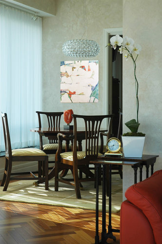
Paintings from Barbara Jacobs Water Conversations series shown in an interior setting
AS: What is a neutral color? How does this affect the designs you create for clients and the art that is used?
BJ: Neutral! What a word. What does it mean? “Goes anywhere?” Thankfully it is not only about gray (as black + white mixed in various percentages).
I love the conversations I have with clients about what defines neutral, and what options can realistically function as such in their homes or other spaces. Words like taupe, beige, tan, and even off-white are so subjective, they actually have little meaning in physical reality. Color names can be confusing to clients and create emotional predisposition to their liking or rejecting particular colors. Plus, people literally see colors differently and attribute personal characteristics to the colors…it is blue, or green? Pink, or orange?
Neutral colors for environments can include a wide variety from the B/W grays in various depths to the more toned-down blues, greens, reds, and violets. To function in a practical way as a neutral color, the paint, for example, should contain elements of many other colors in it, and be less saturated. For wall paint, one way designers accomplish this is to use Full Spectrum Paints (like those from Ellen Kennon). Then, depending on other design elements, many types of artwork can be used. Ultimately, it’s all about balance between the basics of light and dark, high and low chroma, texture both visual and physical, and assembling various hues together.
With all wall colors, lighting in the client spaces is critically important. It can determine the outcome and how the artwork looks in the space. This is always an observation and often becomes part of the discussion.
AS: How can artists use color knowledge to select images for in situ photos?
BJ: When you look for work you want to feature in these images, consider the décor of the site and think about how your work and the location will complement each other. Sometimes you might want to choose an art piece that contrasts with the location, like a contemporary painting or sculpture in a more traditional setting. Designers will use antiques mixed with modern furnishings for this effect.
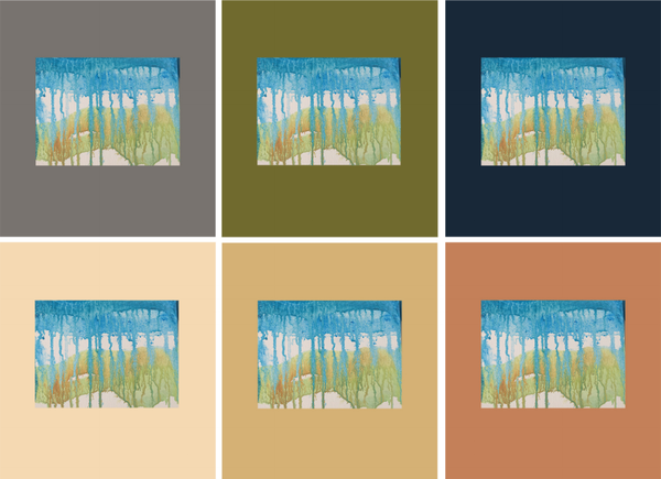
Did you know that trend colors, like “colors of the year,” are not necessarily new colors? Paint companies often use existing formulas and color names and select them for special notice and combinations. These examples of wall colors are from those groups.
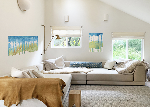
Backgrounds for in situ shots can vary widely, depending on the effect you want, as shown in this rage of cool and warm colors.
When you create images of artwork in situ, think about creating ambiance in your photos. Is it warm or cool overall? The degree of contrast and movement all play a part. Colors in artwork can be a contrast, a focal point, or have a quieter presence by blending more into the background. Also, consider the surfaces in the image. Sheen, texture, and pattern can all contribute to the overall scene that includes our artwork.
Learn more about Barbara Jacobs by visiting her art website.


What a fascinating conversation! As an aspiring artist deeply intrigued by color psychology, this interview was incredibly insightful. Learning about the thought process behind color selection and its impact on emotions and environments is truly inspiring. It’s evident how much expertise and passion goes into being a color consultant. Thank you for sharing such valuable insights and shedding light on this fascinating aspect of art and design!
Thanks for your comment. And thanks for reading the article!